


Welcome to my personal project where my outfit matches my surroundings!
This project started accidentally when I kept walking into places and seeing that I somehow matched. So when I took a photo/art class and the teacher said “, Why don’t you match on purpose!” the lightbulb went off and I thought “WHY DON’T I?” The MATCHY MATCHY POWER CLASHY project was born.
Here’s are images I’ve photographed of myself (unless otherwise noted) from 2019 until the present.
You can follow along on Instagram via the hashtag #matchymatchypowerclashy
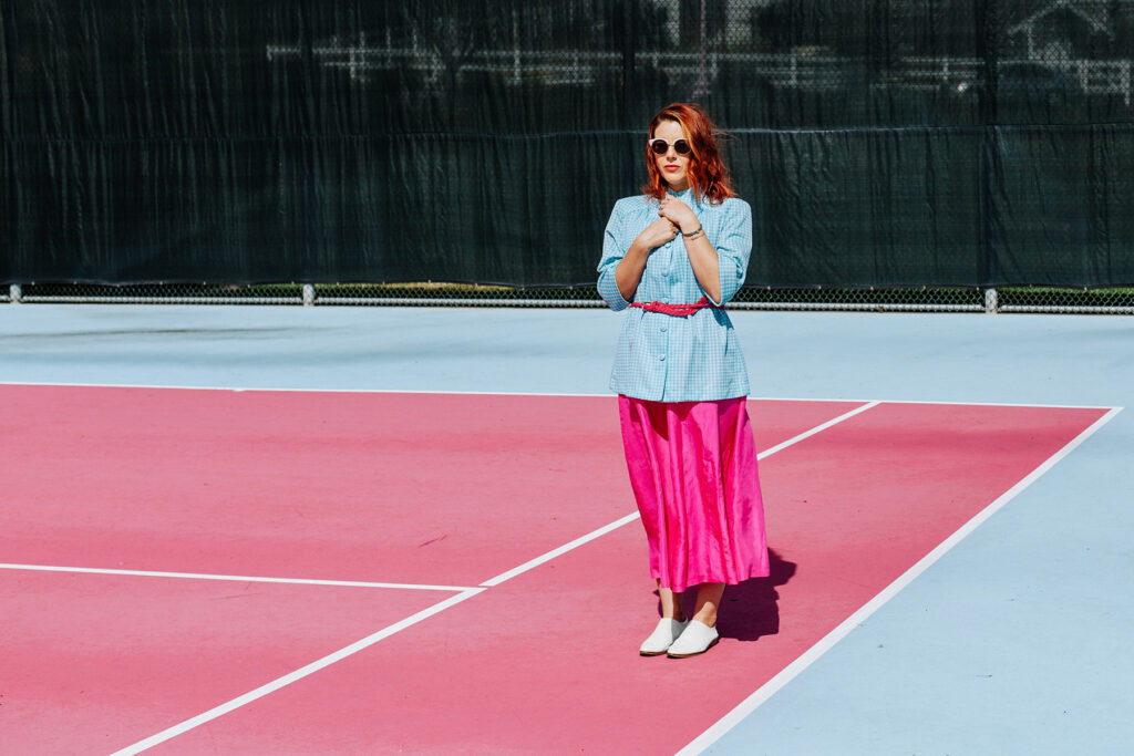
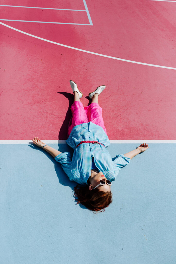
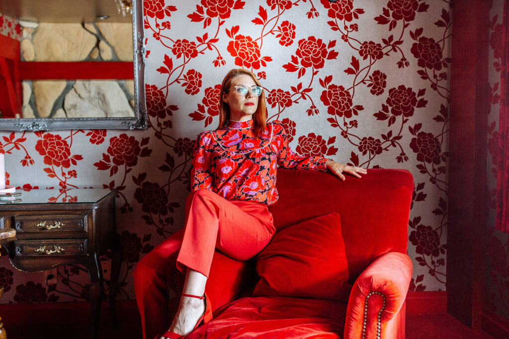
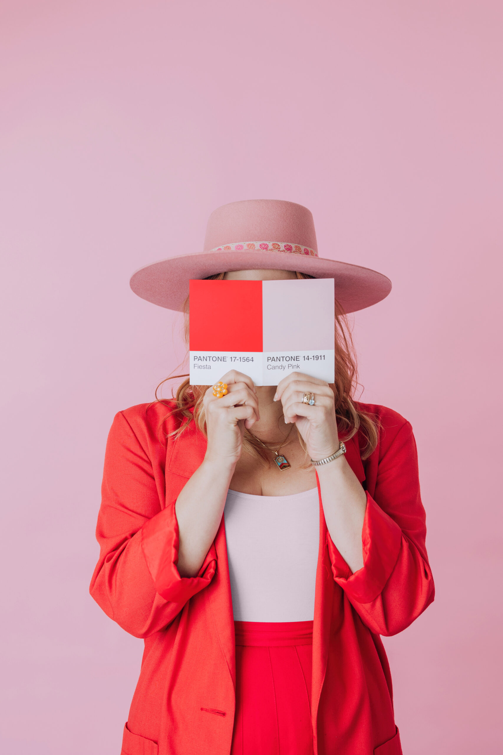
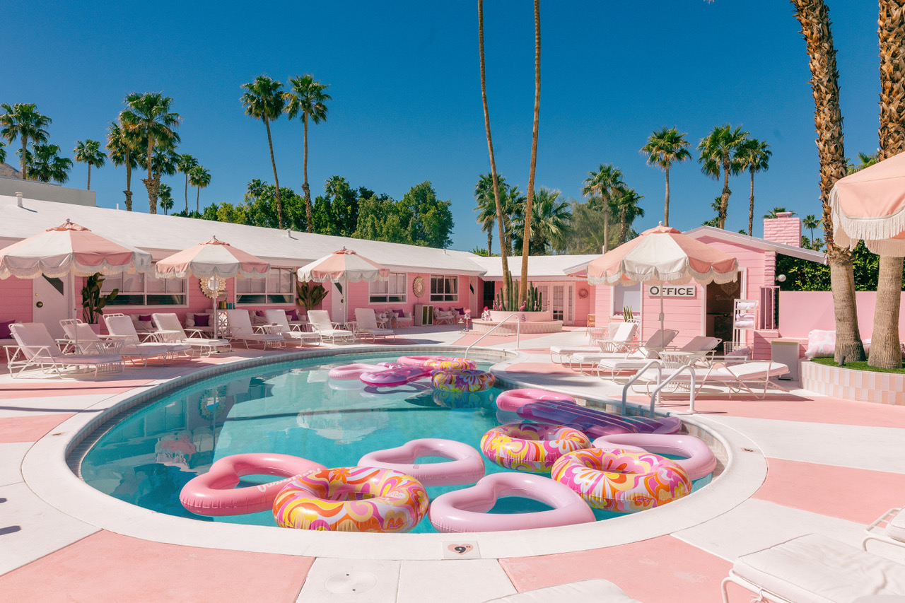
There’s something magical about the moment when your outfit blends seamlessly into the backdrop of your surroundings as if the world itself styled you for the shot. Over the years, I’ve made a little creative game out of matching my wardrobe to the most colorful, character-filled locations I visit. From the bright pops of Palm Springs to a red-and-white striped house in Portugal, each look is intentionally styled to complement the colors, patterns, and mood of the setting. In this post, I’m sharing some of my favorite color-matching shoots and the simple tricks you can use to make your own travel or brand photography pop.
From pink tennis courts to striped houses, see how photography comes alive with perfectly matched outfits and locations.
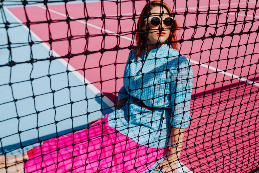
The Tennis Courts at Madonna Inn in San Luis Obispo
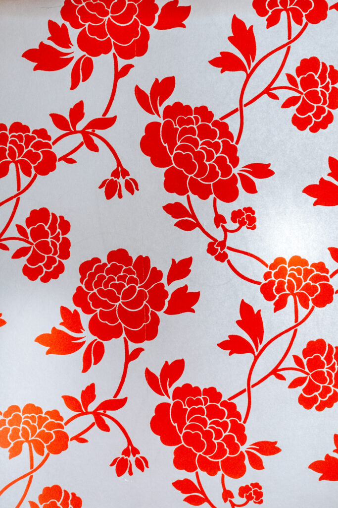
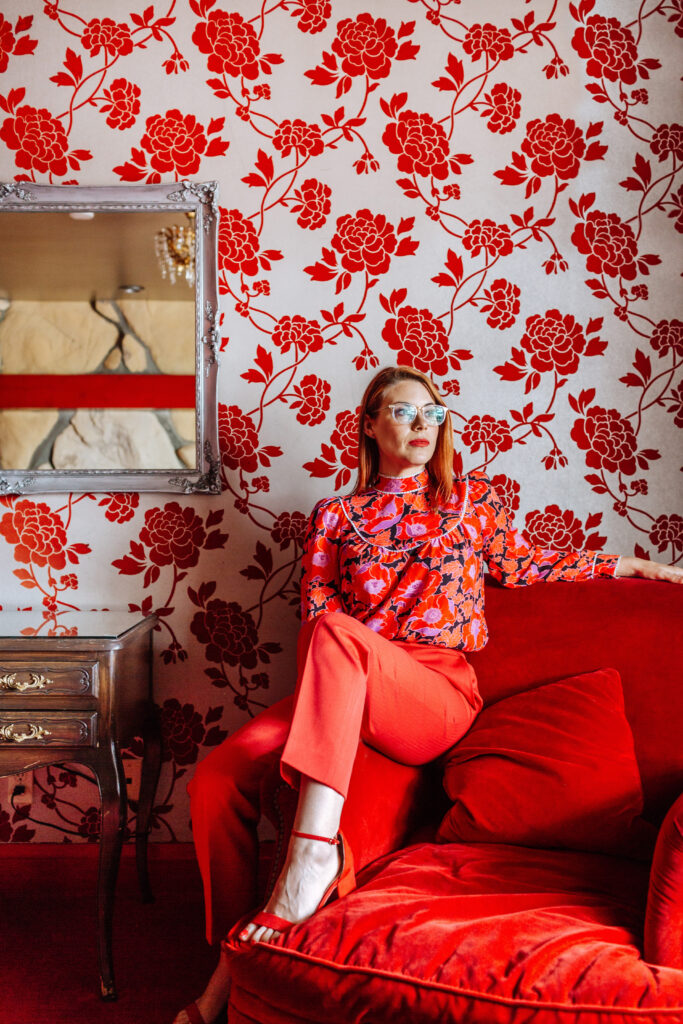
Hearts and Flowers room at Madonna Inn, San Luis Obispo.
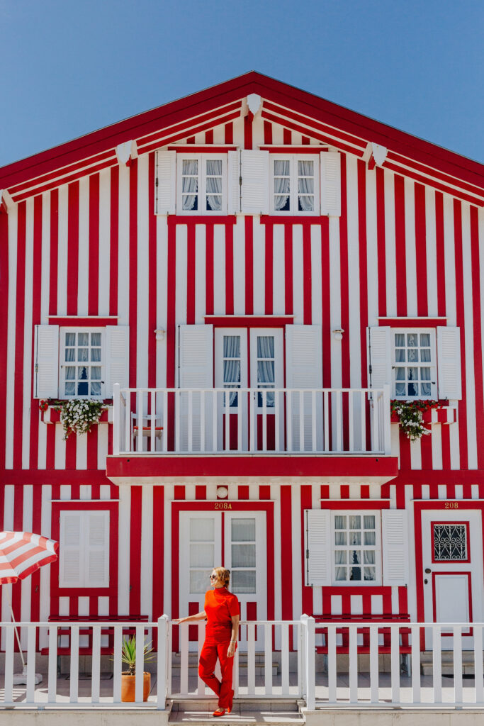
Red and White striped house in Aveiro Portugal
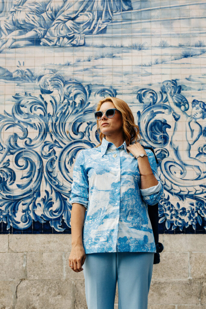
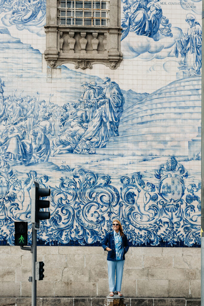
Famous Blue and white church in Porto, Portugal


+ show Comments
- Hide Comments
add a comment